link: Marvin's E-Portfolio
intro:
Welcome to my E-Portfolio!
My name is Marvin Johnson III and I am a Psychology BA major, Spanish minor, and Schreyer Honors Scholar at The Pennsylvania State University (Class of 2014). Please, allow me to introduce myself and my E-portfolio further.
Fall 2009 - Spring 2010 -- Non-metriculating PSU Student:
My collegiate career with Penn State technically began in my senior year in High School. I became a non-metriculating student through a partnership between the Middle Bucks Institute of Technology in Jamison, PA and the Penn State Abington branch campus. I took 8 credits in 3 Penn State courses: Mammalian Anatomy, Physiology, and Physiology lab. By doing so, I started off my collegiate education strong by receiving an A- in each of the most rigorous courses I have ever taken.
Fall 2010 - Spring 2011 -- Freshman PSU Honors Scholar:
Before I could finish my education with Penn State Abington, I accepted a full-time undergarduate student offer to the Schreyer Honors College at Penn State University in University Park, Pennsylvania. I entered my freshman year with 24 credits and would finish the year with 59.5 credits. With my selected major of Psychology BA I hope to take my experiences in college to lay a foundation for a future career in counseling. Outside of gaining experience in three courses of Psychology (Honors introductory, Career, and Social Psychology), I began the process of completing a Spanish minor; with it I hope to become fluent in the language.
E-portfolio Introduction
This E-portfolio will act as a space for the compilation of works throughout my collegiate education and will serve to encapsulate who I am as a student. I will continue to post my written (essays) and verbal (speeches) work, and my internet weblogs (blogs). Finally, if you would like to reach me personally, you may do so under the contact page.
Monday, May 2, 2011
Friday, April 8, 2011
Kindle Ad Magic
Considering my readership is made up almost entirely of the individuals in my LA101H group, I thought I would pay tribute to our successful presentation with a little more Kindle fun. Since I absolutely love quality advertisements, I have to hand it to Amazon for its marketing campaign of their popular ereader. Whilst perusing Kindle’s Youtube page, there was not a bad ad in the bunch, but my favorites were surely the original commercials.
Today’s technology seems to be most successful when the complexity only comes from the number of features it allows a consumer to discover. Otherwise, the goal for marketers is to make their products seem simple in order to give them character. Kindle understands that the consumers they truly need to win over are those who love the simplicity of books and are wary about the coldness of an electronic device as opposed to the nostalgic warmth of a book.
This commercial surely delivers the desired appeal with a creative and stripped-down stop animation approach; Amazon makes it perfectly clear from the start that with the Kindle they hope to preserve the simple artistic pleasure a book brings with their new gadget. The music lacks complexity as well, as it is only a piano and a woman singing. Nothing about it sounds or looks "electronic" in any way; on the contrary, everything has a home-made warmth to it. Meanwhile, Kindle literally answers the question it poses in the song: “Will you fly me away?” as if they are answering the inquiries of skeptical potential buyers who are not sold on whether or not kindle will give them the escape into the stories that they find in the pages of a book.
Colorful, creative, and simple; Amazon portrays its kindle in a light that is contrary to the perceptions of those clinging onto the traditional book. The commercial mirrors a product that has character, not the cold, calculative feel that resembles an image model such as Apple’s . While Steve Jobs and company embrace the seemingly sterile yet streamlined design of their electronics, Amazon hopes to maintain a sense of charm that is palatable to book readers who are fearful of the potential tech domination of ereaders.
Thursday, March 31, 2011
Advocacy in Civic Life
 Today’s Rhetoric and Civic Life class centered around the concept of advocacy, which is essentially the placement of one’s support behind a cause, a group, or a concept. What I found most interesting about advocacy is that a person is changed by what he or she advocates and he or she in turn affects and shapes the advocacy group in question. I was personally intrigued by a story by my classmate John Lee regarding how a light suggestion for him to swim turned into a position on the team and furthermore roles as a lifeguard and a swim instructor. Looking back on his story, I thought I might share my own experience in an advocacy that has changed me and I hope to change.
Five years ago I reluctantly began attending my church’s youth group in order to have something to do after school that my mother found constructive to my spiritual growth beyond Sunday school (which I had just outgrown). It seemed like the natural next step in my journey yet I did not really embrace it until I met lifelong friends in my first mission trip in Philadelphia. Since then I have been changed in so many ways; not only have I participated in missions from Montreal to Guatemala City, I have witnessed a spiritual growth within myself. I am currently with my third “youth group”, a campus ministry called Reformed University Fellowship (RUF), and while my youth ministries have affected me, I am poised to affect my youth ministries as well.
Although I am merely a freshman, I am prepared to take on any leadership roles that may come across my path in my coming years in college with RUF. I have led in one bible study already and have even returned to my high school ministry to lead middle school students in their study of scripture. This summer I also plan to begin work at my home church to coordinate a college ministry for students home from college starting this summer. The student ministries I once so hesitantly advocated became a force of great growth in my life, and in turn I hope to do the same in my mission to strengthen these groups.
Thursday, March 24, 2011
"For Your Viewing Pleasure"; Visual Rhetoric
This week’s lecture in LA101H focused on the rhetoric of visual images. As humans we are a very visual species, and images can have a powerful effect on emotion and a strong influence on the way we approach things. Our love of aesthetically pleasing images has transcended the canvas, and now visual art has found a home in some of the most surprising locations. With the advent of the computer and sophisticated software in particular, technology pushes the boundaries of artistic expression in ways never before seen. One example of art is album artwork; the covers of music CDs and formerly records.
Album artwork is the first impression between an album and the potential consumer; it is the sales pitch which finds its importance in the fact that we simply can’t help but “judge a book by its cover”. These are some of my favorite pieces of album artwork from my own music collection:
One of the keys to an aesthetic image is the utilization of a focal point in order to present an image the eye can follow its focus upon. The album The Resistance by Muse does this so well with the clear lines formed by the bridge-like structure and all of the geometric shapes meet at the image of the earth. Meanwhile, a mosaic of hexagons creates an array of colors that give the entire image an interstellar, science fiction feel. Meanwhile, all colors are brighter toward the center, adding to the focal point, while the gray border enhances the color vibrancy.


Thursday, March 17, 2011
Copyrights, Memes, and Clichés; Oh, My!
In class the other day, we learned of the importance of copyright laws and the powers they hold over electronic media today. On top of that, we learned the limitations of copyright in the form of fair use. One of the more notable examples of fair use we covered regarded the use of films. When using a copyrighted motion picture, the limits of fair use include the nature, amount, and commercial impact of material used. Basically only small portions of a film can be used in a way that does not serve as a substitute for the original work.
The use of movies often is found on the internet in the form of internet memes, which are ideas spread throughout the internet and take on a pop culture status. These concepts are both dispersed throughout the internet and are reshaped in a variety of ways; the memes are at the mercy of the creativity of those who find them. Memes are such a fascinating aspect of the internet that there is an entire website dedicated to following and analyzing them.
The website is called KnowYourMeme.com and it is a database attempting to organize the incomprehensible breadth of the countless memes circulating throughout the internet. Although it is not a perfect website (searching can be difficult and popups can occur), it is both informative and extremely entertaining.
One especially entertaining meme is titled “Supercut Movie Clichés”. This particular meme encompasses varying movie clips that share a commonality such as a catchphrase (i.e. “He didn’t make it”, “We’re not in Kansas anymore”, etc.) and cycles through the commonality in each of the different movies. The comedic value lies in the worn-out phrases in critically-acclaimed movies. It would seem like a no-brainer to avoid these lines (such as “no-brainer”), but they constantly occur in these films. With respect to copyright, the videos are applicable in that the clips of the movies are extremely brief and serve a separate purpose so as not to replicate the original work.
“We’ve got company”
Thursday, March 3, 2011
Something Strange in the Hidden Valley Pies...
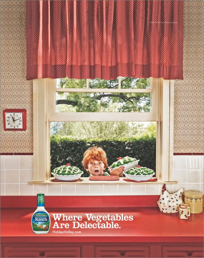
Since I showcased my favorite motion picture advertisement, “Write the Future”, last week, I thought I would show you one of my favorite still picture ads for this week’s installment of Rhetoric and Civic Life. This one is brought to you by Hidden Valley Ranch, and I discovered it so long ago that I can’t quite remember how I stumbled upon it. All I know is that I can vividly remember the image of the boy stealing that broccoli pie!
The style of the advertisement oozes classic Americanism from the polka-dot drapes to the windowsill pies. Hidden valley is clearly trying to recreate the mid-20th century in order to invoke a classic image. This is important because the dominant portion of the advertisement is the image of the kitchen itself. The old-fashioned setting invokes images of the simplicities of the 50s and 60s and may even conjure up images of grandma’s kitchen.
All in all, the image is one of familiarity, a common tool of advertisements (especially those of a more comedic nature). The goal is to begin with a familiar scene and then introduce an element of the unexpected. The setting is so large that it does not take the reader much effort to notice the kitchen, so in that regard it is recognized first. The unexpected occurs in the focal point of the advertisement, the image the eyes are easily drawn to.
Although the setting is apparent first, the eye is actually drawn to the image at the center of the ad, the boy sneaking a pie off the windowsill, neatly set apart from the inside by the window. Here we find the beauty of the advertisement: the alteration of the American image of the apple pie and the mischievous boy (a la Tom Sawyer) with a Hidden Valley edge to it. The viewer recognizes that the apple pie is in fact a broccoli pie with hidden valley ranch as the lattice. It makes the broccoli look downright decadent and it exemplifies the caption of “Where Vegetables Are Delectable”, a perception of a literal “Hidden Valley” where broccoli is as tasty as homemade pie.
One final point of note is the use of reds and greens; the two colors are complementary and make a clear contrast between the kitchen scene inside and the pie theft scene outside. Also, there is no accident over the incorporation of the boy’s red hair and the cherry tomatoes topping the pies for added aesthetic effect. I find this advertisement simply memorable!
Thursday, February 24, 2011
Write The Future

Since we nearly wrapped up speeches today in LA101H based on rhetorical analyses of advertisements, I still find myself in a commercial state of mind. Up until the point in which I realized there would be a 4-6 minute time limit on the speech (including the time of the advertisement!) I had one commercial in mind. Sadly, the ad is a marathon clocking in at 2 minutes 53 seconds. It is definitely a worthy 2:53 spent however, and it is the kind of video where you pick up something new with each view and are never entertained any less than the first watch. However, such an ad would not possibly restrict itself to the time limit of the speech, so I thought this would be a better arena to state my case.
The name of the commercial is “Write the Future” and it is under the Nike label. As my classmate Tessa Johnstone so eloquently put it, often times Nike is not trying to sell a product; rather, it attempts to offer consumers a lifestyle. Although in this ad Nike clearly hopes to generate interest in the world cup (personally, they had me at “Drogba”), it makes the World Cup out to be a grandiose cosmic force of destiny impacting the players, fans, and nations involved instead of just a sporting event.
This epic advertisement takes the viewer from a meager home in the Ivory Coast to the halls of the British monarchy and everywhere in between while highlighting soccer's impact. Meanwhile, it is combined with the perfect blend of comedy (the lackey getting his butt kicked at table tennis is Roger Federer, priceless!) and soccer action to make a believer out of any World Cup doubter.
You may not know who Wayne Rooney is, but the commercial makes you want to know who that bulldog-faced Brit is and why he has England’s fate on a string. Even if you don’t recognize the mastry of Ronaldinho, you still want to know where you can see moves worthy of the emulation of Brazilian dancers and Kobe Bryant. The ad may even have female viewers hoping to get better acquainted with the Portuguese stud with the perfectly coiffed hair (Cristiano Ronaldo).
Nike might not be trying to push a lifestyle this time around, but if they are trying to sell us anything it is the idea that these players are titans who shape the world from the ends of their cleats. If you don’t know their names, you better start catching up.
Here is the commercial itself...
…And here is the “Making Of”
Subscribe to:
Comments (Atom)